Award-winning UX from regular user testing
Card at Standard Bank (2015 - 2016)
The context:
I joined Standard Bank (client) as a consultant to be the Design Lead for the Card, Loyalty, and Emerging Payments team. Within the company, different business areas were split out and each had a Design Lead, Technical Lead and Product Lead. That triad model worked really well within the team.
My focus was on how people interact with, manage, and control their (physical) bank cards within the banking app.
Over the course of the 2 years that I was at Standard Bank, I worked on various Card projects. Some features added to the banking app included:
Stop a card
Set a card to be used overseas
Managing limits (ATM, EFT)
Change statement delivery from post to e-mail
Set up a payment order
Activate a card
View the pin
Virtual Cards
The progress:
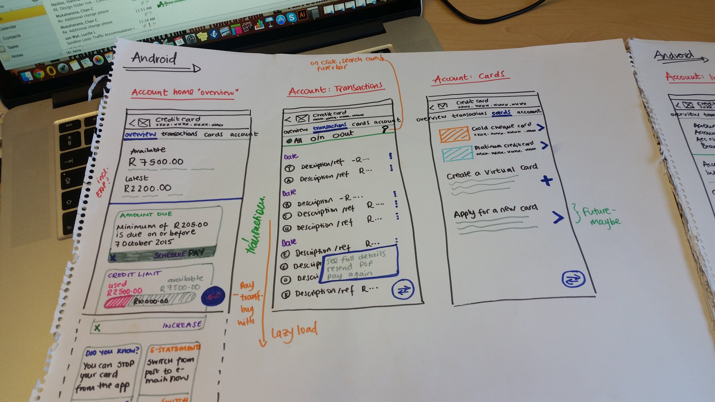
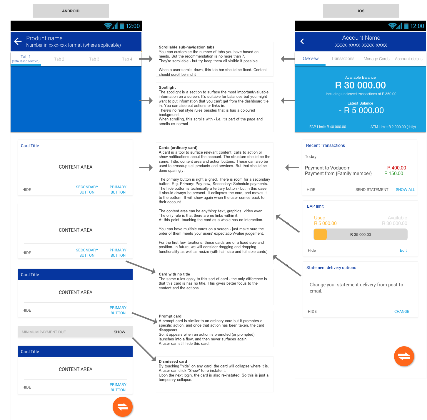
Some significant contributions include helping define a “Search v. Filter” model, furthering the introduction of Material Design into the app(s), and defining the Account Views across all accounts (not just Credit Card).
I also managed to model the various ways that users view the “card v. account” relationship which helped tremendously in designing card features.
This sort of work had not been done in the card business yet.
Virtual Card
The Virtual Card feature was a particular highlight. Long before our current familiarity with virtual cards, my team worked on the idea. I led the UX and tested with customers who were wholly unfamiliar with the concept. Their input was crucial since we’d be launching to a market that didn’t know, understand or (yet) trust the feature. Using the feedback, we were able to give the right amount of information and assurance while keeping the feature innovative.
This work was released a while after I’d left Standard Bank, but was well received by the public has been honoured multiple times over the years, notably the Banker Tech Projects Award in 2019 and the Tech Innovation award in 2019 at Africa Tech Week. It also yielded excellent results for the business - with an upswing of 300% using virtual payments in just nine months.
My contribution
I was the Design Lead in the team, and it eventually grew to include 2 UI designers and another UX designer.
My role was to optimise all card features for the end-users, as well as to work with other teams to maintain consistency throughout the app.
I did user testing every week and incorporated the feedback into the designs. That was my favourite part of this job - and I have missed that level of user interaction ever since.
What I enjoyed:
Frequent user testing & interaction
Big picture as well as detailed design
“Owning” a product (or part of it…)
What I struggled with:
Infrequent releases
Silo structures, bureaucracy
Too much reliance on other teams for input
Tools I used:
User research & testing
User journeys & process flows
Information architecture
Wireframes & Prototypes
Storyboards


